
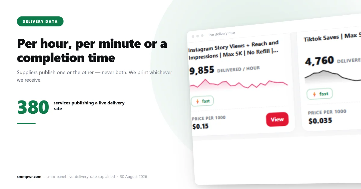
Open the price list on almost any SMM panel and the delivery column says one of three things: a vague adjective ("instant", "fast", "high quality"), a range somebody typed once ("0–1 hour"), or nothing at all. Ours says one of two things, and neither of them was typed by a human.
Some rows carry a completion time — "29 minutes", "1 day 13 hours". Others carry a delivery rate — "4,266 per hour", "268 per minute". They are not the same measurement, they are not interchangeable, and the difference decides whether the number is any use to you. This is what each one means, why we refuse to convert one into the other, and what an empty cell is actually telling you.
A completion time is a rear-view mirror
A completion time is the average across orders on that service that have recently finished. The supplier computes it from its own order history and we copy it across without touching it.
What it is good for: comparing two services that do the same thing. If one Instagram followers service finishes in 31 minutes and the next one takes 1 day 13 hours, that gap is real and it will show up in your order.
What it is not: a promise about your order. It is an average, so half the orders took longer. It also says nothing about when delivery starts — a service can sit for an hour and then finish in ten minutes, and a service can start instantly and trickle for a day. Both average out the same.
Across our catalogue on 25 August 2026, 491 of 1,089 services published a completion time. The median was 5 hours 18 minutes; a quarter finished inside 1 hour 53 minutes, a quarter took longer than 21 hours 31 minutes, and the slowest service on the list averaged 10.5 days. That spread is the reason a single "fast delivery" badge on a panel homepage is worthless.
A delivery rate is a speedometer
Some suppliers do not publish a completion time at all. They publish throughput: how many units that service is pushing out right now. On our list that appears verbatim — 343 services carried a rate on 25 August, most of them per hour, and around three dozen of them fast enough that the supplier reports them per minute.
A rate answers a different question. "4,266 per hour" does not tell you when your order finishes. It tells you how quickly the queue in front of you is draining and how much capacity the service has. For a 500-unit order on a service running at 4,266 an hour, capacity is irrelevant — you are noise. For a 500,000-unit order it is the only number that matters.
Rates also move faster than completion times. A completion time is an average over days of history; a rate is a snapshot that can halve in an afternoon when the supplier's own upstream slows down. Ours are refreshed every four minutes for exactly that reason — the completion times we compute ourselves are recalculated every thirty.
Why we do not convert one into the other
The tempting move is arithmetic: take a 10,000-unit order, divide by 4,266 per hour, publish "2 hours 21 minutes" and give every row a tidy completion time. Plenty of panels do a version of this.
We do not, because that number would be a calculation of ours wearing the costume of a measurement of theirs. It quietly assumes three things that are usually false: that you are alone in the queue, that the current rate holds for the whole order, and that the service starts the moment you pay. Miss any one of them and the "measurement" is wrong — but it still looks precise, which is worse than saying nothing.
So a rate stays a rate. If the supplier publishes throughput, you see throughput.
The colours, and what they are allowed to claim
Every delivery figure on the price list carries a colour band, and the rule is deliberately narrow:
- Green with a flame — the supplier is currently sending more than 1,000 units an hour, or the measured completion time is under 30 minutes.
- Red — slower than that, on whichever figure the service publishes.
- No colour — we hold no measurement for that service. A colour is a claim, and we do not paint one we cannot support.
On 25 August the split across 1,089 services was 321 green, 513 red, 255 uncoloured. We publish that ratio rather than hiding it, because a panel where every row is green is a panel where the colour means nothing.
One deliberate consequence: a red row is not a broken row. Twitch live stream views for a month-long broadcast should take days. Red means "slower than the threshold", not "avoid this". It is there so that a service which is slow for no good reason cannot hide next to one that is slow by design.
An empty cell is a real answer
324 of our 1,466 services show nothing in the delivery column. That is not a bug and it is not laziness — it means the supplier publishes no figure for that service and we refused to invent one.
The same rule applies to stale data. Our delivery feed is stamped with the moment it was written, and the page checks that stamp before it prints anything. Nothing older than six hours reaches the screen. If the feed stops, the column empties and the page says so, rather than showing last night's speeds as if they were this morning's. An invented number makes a dead service look alive; an old number makes a slow service look fast. Both are the same lie with different timestamps.
Drop rate follows the same rule. Only 44 services publish one, so the field is blank on most rows. We would rather be visibly incomplete than quietly fictional.
Where you actually see these numbers
The data is not buried in a report. It sits on the row you are about to click:
- The price list. Every row carries the delivery figure, the colour band, the drop badge where there is one, and the refill mark on the 542 services that carry a guarantee.
- The Popular services strip above the list. Fourteen cards drawn from whatever is running fastest at that moment — a pool of 321 services on 25 August. Each card shows the live rate, the trend behind it and the price. The price is read out of the row underneath rather than fetched separately, so the card and the list can never disagree, and the strip reshuffles every thirty minutes so it is a sample rather than a fixed top ten.
- The order screen. It opens with one tile per platform, plus an All tile, generated from the live category tree. Picking a service shows its order limits, refill term and support status, and points back to the price list for the delivery figure — because that figure changes, and a description does not.
- The bell next to your balance, which lists every service opened in the last six hours, newest first.
What changed in the last week
Since 20 August the catalogue and the screens around it have moved, so for anyone comparing against an older look at the panel:
- Seven new platforms opened: Spotify (64 services — plays, free plays, playlist and album plays by country, followers, monthly listeners and likes), Audiomack (23), BlueSky (17), GitHub (13), bulk SEO backlinks (5), Pinterest and Yandex Music. Pinterest and LinkedIn were also filled out from a handful of services to 33 and 75. The catalogue now runs to 1,466 services across 21 platforms and 145 categories.
- Per-minute rates appeared. One supplier switched its reporting unit, so the fastest services now read "268 per minute" instead of a four-digit hourly figure. Same measurement, finer resolution, printed as received.
- The Popular services strip moved from "most ordered" to "fastest right now", spread across platforms so it is not fourteen Instagram cards.
- The order screen's platform tiles are now built from the category tree instead of being guessed from the first word of a service name. The old method invented platforms that did not exist and cut the list at twelve; every platform in the catalogue now gets a tile the day its first category opens.
How to use this when you are buying
- Check which figure the service publishes before comparing two of them. A completion time and a rate are not comparable, and a panel that shows both as one number has done arithmetic on your behalf.
- Match the figure to your order size. Small order: the completion time is what matters. Large order: the rate is what matters, because you will be the queue.
- Treat the empty cells as information. A blank field means nobody measured it — on a panel that fills every cell, it means somebody made it up.
- Read the drop rate before the price. Cheap engagement that leaves in a week costs more per surviving unit than a service twice the price. Only what survives counts.
- Check the refill term in the name. "30 Days Refill" and "No Refill" are the two ends of the same sentence, and they are written into the service name rather than hidden in the terms.
All the figures above come from our live catalogue on 25 August 2026 and will have moved by the time you read this. They are countable for yourself on the price list, which is the point: numbers you can check are worth more than numbers we can promise.
Related reading: drop rate and average time explained, how to choose an SMM panel without getting burned, and the open delivery time report.
Related services
What this article describes, on the price list:
- Instagram Followers — 173 services from $0.73 per 1000
- Pinterest Followers — 8 services from $3.58 per 1000
- Spotify Plays — 39 services from $0.14 per 1000
- Instagram Likes — 171 services from $0.0051 per 1000
- Instagram SMM panel — the whole catalogue for that platform