
Almost every SMM panel shows you the same three things: a service name, a price, and a minimum and maximum. That is not enough information to make a decision, and the industry knows it. The gap gets filled with adjectives instead: "high quality", "non-drop", "instant", "real users", none of which are measurements.
There are three numbers that actually tell you something. Here is what they mean.
Drop rate
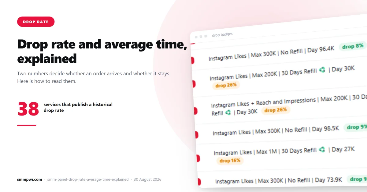
Drop rate is the percentage of a delivered order that disappears afterwards. You order 1,000 followers, 1,000 arrive, and two weeks later 340 are gone. That is a 34% drop rate.
Drops happen because the accounts providing the engagement get removed, deactivated, or mass-purged by the platform. Instagram runs periodic sweeps that remove large numbers of inauthentic accounts at once, which is why drops often arrive in a cliff rather than a slope: nothing for ten days, then a third of the order vanishes overnight.
Three things follow from this:
- "Non-drop" is a claim, not a category. No service can guarantee that a third party's accounts will survive. Services that say non-drop are describing a hope.
- A refill guarantee is worth more than a low advertised drop rate. A guarantee is enforceable from your orders page; an adjective is not.
- Compare drop rate against price, not in isolation. A service at $0.45 with a 30% drop rate delivers 700 surviving followers for $0.45. A service at $0.80 with a 5% drop rate delivers 950 for $0.80. The cheap one is $0.64 per 1000 surviving; the expensive one is $0.84. Now the comparison is real.
Average completion time
Average completion time is how long orders on that service have actually taken, measured across real completed orders. It is not the same as the start time, and it is not what the service description promises.
The distinction matters. "Instant start" tells you the first unit arrives quickly. It says nothing about whether the remaining 999 arrive in twenty minutes or four days. A service can have an instant start and a 60-hour average completion time; plenty do.
Read this number against your actual need. If you are boosting a post in its first hours to build engagement velocity, a service with a 40-hour average is useless to you regardless of how good it is otherwise. If you are building a follower base over a month, a slow service is fine and often looks more natural.
One caution: an average hides its own distribution. A service averaging six hours might complete most orders in one hour and a few in three days. The queue is what tells you which situation you are walking into.
Queue time
Queue time is how much work is already waiting on that service before yours starts. Read next to the average completion time it tells you whether a service is healthy right now, which the average alone cannot.
What the combinations mean:
- Short queue, steady average: the service is working. This is the one you want.
- Long queue, steady average: it is busy but moving. Your order will start later than the average suggests.
- Long queue, rising average: the backlog is growing faster than it clears. Something is wrong upstream. Wait.
- No published time at all: nobody measured this service. Treat it as unknown, not as fast.
A service that was excellent last month can be dead today. Provider networks change constantly and platforms close delivery methods without notice, so the figure that matters is the current one, not the reputation.
Why most panels do not show any of this
Two reasons. The honest one is that it is work: you have to poll every provider continuously, store the history, and keep it current. The less honest one is that the data is often unflattering. A panel admitting that it cannot measure a third of its own catalogue is a panel that has just talked you out of those listings.
Some panels solve this by generating the numbers instead of measuring them. If a service's "average time" is suspiciously round, identical across dozens of unrelated services, or changes every time you reload the page, it is decorative.
How we handle it
We poll our provider network every four minutes and publish what comes back: measured average completion time, current queue time, and historical drop rate.
Where a provider does not publish a figure, we leave the field blank. This is deliberate. The alternative, substituting a queue time for a completion time or filling the gap with "Instant", produces a page that looks more complete and tells you less. An empty field is honest information: it means nobody measured this, so do not treat it as measured.
Of the 1,466 services in our catalogue, 1,125 carry at least one provider-reported figure: 1,079 publish a measured completion time, 46 publish a current delivery speed, and 39 publish a historical drop rate. The other 341 publish nothing at all, and we leave those fields empty rather than fill them.
A practical ordering routine
- Filter to services that match your platform and target country.
- Discard anything with no published completion time, or a queue that keeps growing.
- Compare cost per surviving unit, using drop rate, not headline price.
- Check that average completion time fits your timing need.
- Prefer a refill guarantee over a low advertised drop rate.
- Place a minimum-size test order first. The median minimum across our catalogue is 10 units, and 90% of services start at 100 or fewer.
That routine takes two minutes and eliminates most of the ways an SMM order goes wrong. You can see the live figures on every service on the services page, and pull the same catalogue programmatically through the API.
Related services
What this article describes, on the price list:
- Instagram Followers — 173 services from $0.73 per 1000
- Instagram SMM panel — the whole catalogue for that platform